|
As the game industry grows larger, more and more competitions also arise as more and more individuals are looking for a spot for themselves in this industry. With a significant amount of people coming in, it is important to make yourself stand out from the rest. One of the ways to do this is with a well-made portfolio. A professional portfolio is crucial. With this much competition in the industry, you need to stand out and appeal to the employers. You need to present your portfolio in a way that will captivate the employer's attention. Your portfolio should showcase your talents and mold towards the company and positions you're going to be hired into. Presentation of your portfolio is also important. Be unique in your artwork, have some pieces that are related to the position you are going for, and making sure all of you artworks is consistent in quality (As high as possible), all of this can help to bring the employers attention to your portfolio. Being memorable is also a huge bonus for you. Your portfolio should highlight things that you excel at. While making your portfolio, you need to maximize your artwork's quality and minimize mistakes and inconsistencies. Employers will surely try to look for mistakes and inconsistencies in your art pieces. Make sure that you do your very best to minimize them. My portfolio surely needs a huge revamp. I need to make sure my work's style and quality stay consistent. I need to make my portfolio more aesthetic and visually appealing. Summary
Sources
“A Kickass Video Game Art Portfolio.” Midnight Hub, 2 June 2016, https://www.midnighthub.com/blog/2016/06/02/portfolio-is-king/. Sierra Mon. “Top 10 Portfolio Tips for Game Artists.” ArtStation Magazine, 28 Mar. 2019, https://magazine.artstation.com/2019/03/games-portfolio-top-10/. “Your Game Portfolio Is Your Greatest Asset.” GamesIndustry.biz, https://www.gamesindustry.biz/articles/2014-04-30-your-game-portfolio-is-your-greatest-asset.
0 Comments
Elements and principles of design is a fundamental part of photography and video games. The elements of design are lines, shapes, colors, textures, scale, and space. The principles of design are contrast, repetition, alignment, proximity, proportion, emphasis, rhythm, unity, and balance. Many of these elements and principles of design are applied to many video games to make them more visually pleasing to the players. 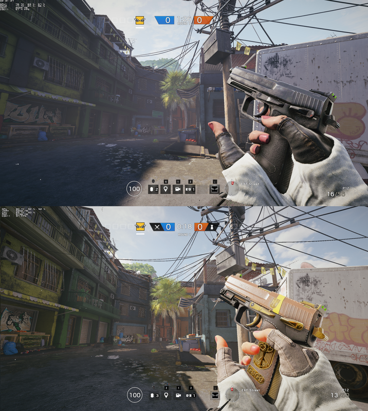 Gaming, HD. “Rainbow Six Siege Blood Orchid Graphic Update.” Flickr, Yahoo!, 5 Sept. 2017, www.flickr.com/photos/22527206@N05/36652704020/in/photolist-XQSFWL-nKegXP-256R3Hw-HznQ3K-RkXMRo-2ai7Sor-25tUmGU-29a65Rq-Vdbm6u-XabXvh-2b2WHNL-26RmNE7-ZRjV56-27TLgYP-22DfAFy-DfZhAG-KFB5BH-KFBcTX-Vdbm2S-29DEnmw-SPCHhk-24Piqs8-JK4ZVd-N89QfQ-Kfub3m-JKb3c4-KwdaYm-V6pZwD-27XnvA9-SZftbq-AsREE1-KfuwQ3-SZftwL-JKaHqr-SZfu4h-jEhY9W-28WADgX-21bh9jy-jEPh7Q-2acpbUS-B3uWeT-B8wiZq-23KLn4E-27saJoM-Lc8e2T-28WA27H-ZJ1aNm-Lc8krM-M28ag6-28x1o5L. Tom Clancy's Rainbow Six Siege is one of the most popular tactical shooters out there. The many unique operators each with different gadgets and the amount of communication and teamwork is attributed to this game's popularity. You could point out some of the elements and principles of the design easily in this image. The contrasting colors of orange and blue is meant to create a sense of opposition between the teams. The white color of the hud contrast with everything else in the map. The emphasis of the weapon helps show it's importance in the game. 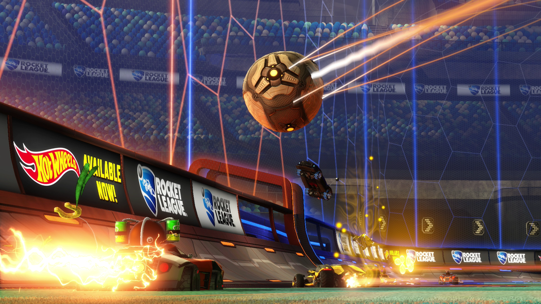 KingsREIGN77. “Rocket League.” Flickr, Yahoo!, 7 Mar. 2017, www.flickr.com/photos/rocketleaguepics/33265545766/in/photolist-SFyBNw-RS9s2m-T6DkCN-WC7wyF-VfRdZe-SoeSJd-RPC49u-SrWUXR-dCLk9v-skNFoB-RFx36i-2Uy6Ue-9VRPjz-ETie8n-29qAjer-7RAXRJ-fzTeqf-pokJZD-VXgWFE-T6DjQ5-5z8br-T6DnwN-29qA7e4-22SmCt4-qax6ZV-5eiDVq-29mq1a5-Wxnykr-VqqhN6-Wto3gh-VYrUSW-JJpXjR-5B5EB8-UL8XEg-qmwmgr-8Mjbpv-WAmmbm-28kbWRU-WC7wMM-SKsTbi-VaUkmN-UWZ7M7-UPaJ84-RsGqcy-298RY4f-5bP9Lu-Z918mm-21WFdc9-26cwuYT-26EPcSm. Rocket League is a vehicular soccer game by Psyonix. The game is pretty easy for casual player to understand. It's soccer but with cars. Like most competitive games, the color orange and blue contrast each other to show a sense of rivalry. The ball in this image is quite large compare to the other cars. The emphasis and the scale of the ball help establishes it's importance in the game. The repeating hexagon and it's color help strengthen the design and creates association between the teams. I think the ball trails should be a different color. The orange trails makes it seems that the ball is somehow connected to the orange team instead of being it self. Pretty much
Source
|
AuthorHi, I'm Thanakorn. This is my blog where I reflect on my work from Game Design :) Archives
May 2020
Categories
All
|


 RSS Feed
